
Fast Charts with Pivot Charting
October 10, 2005
To try this tip on your own computer, download and unzip CFH281.zip.
We’ve shown a lot of examples with Pivot Tables. There is a related technology called Pivot Charting in Excel. With a Pivot Chart, you can build a dynamic chart that is very easy to query and change using a few dropdown selections.
Building a Simple PivotChart
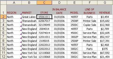
Your data set has columns for revenue, region, market, date, etc. Select one cell within the data.
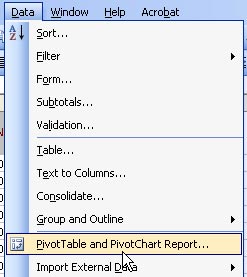
From the data menu, select PivotTable and PivotChart.
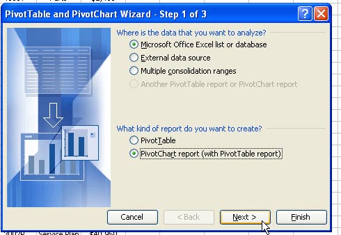
In Step 1 of the Wizard, select Pivot Chart
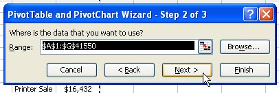
If your data has headings above each row, Step 2 should accurately predict the range of your data.
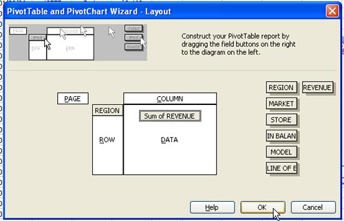
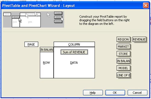
In Step 3 of the wizard, choose the Layout Button
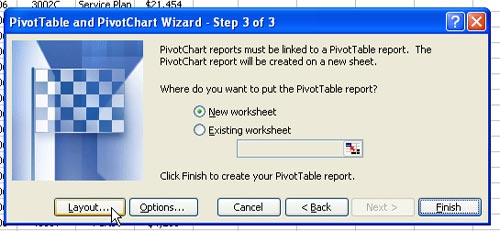
In the Layout dialog, drag Region to the Row area and Revenue to the Data Area. Choose OK to return to the Wizard.
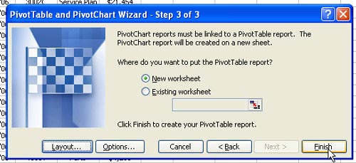
Click Finish to create the Pivot Chart on a new worksheet.
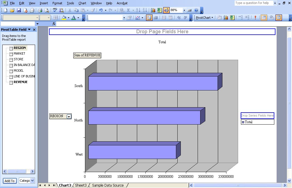
Your initial pivot chart will appear as your default chart format. On most computers, this is a column chart. This particular computer has the default changed to a bar chart, so the initial pivot table is a bar chart. In any case, you want a pie chart here, so the type will have to be changed.
In the pivot table toolbar, select the chart wizard icon
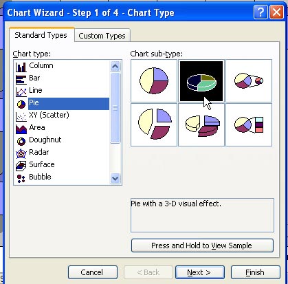
Choose the Pie chart type and then the 3D pie subtype
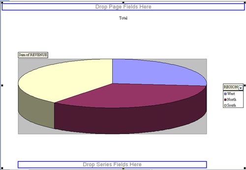
You have now summarized 5000 rows of data into a chart.
Creating a Dynamic, Year-Over-Year Report
Sometimes, it is necessary to build a pivot table first and then change it to a Pivot Chart.
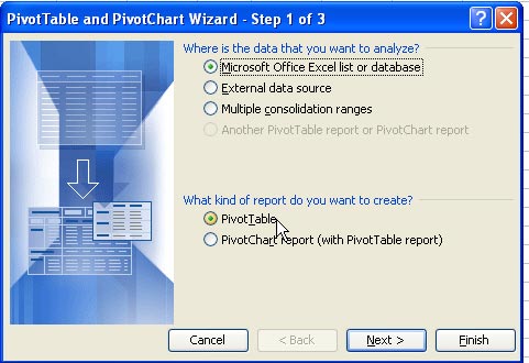
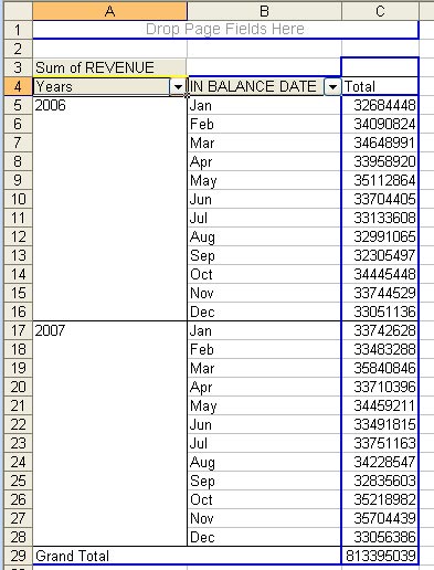
Select one cell in the original dataset. From the menu, select Data - PivotTable. In the first step of the wizard, choose PivotTable.
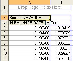
In Step 3 of the wizard, choose the Layout button. In the Layout dialog, drag Revenue to the Data Area and In Balance Date to the Row area.
This initial pivot table is a far cry from the year-over-year report. It will be easy to manipulate this as a pivot table, but very hard to do so if it had been a pivot chart.
Right-click on the date field. Choose Group and Show Detail - Group.
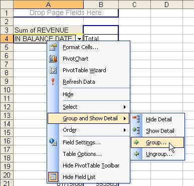
Choose both Months and Years. Click OK.
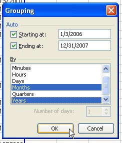
You now have a report by Years and Months.
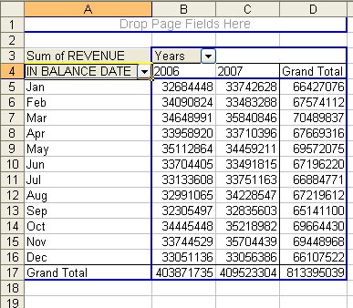
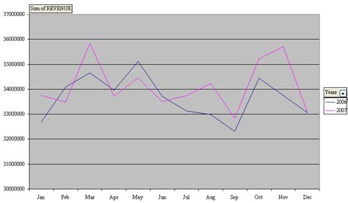
You want the Years to be individual series on the chart, so drag the Years field from A4 to C3. The result is shown below.
Right click inside the pivot table and choose PivotChart.
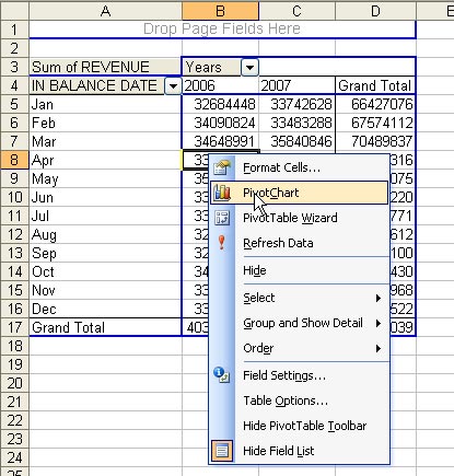
The initial chart will reflect your default chart type.
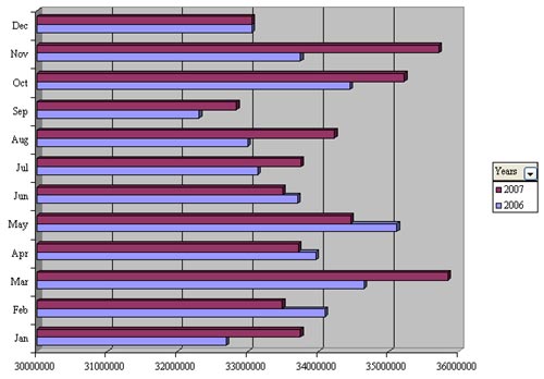
Choose the Chart Wizard icon in the Pivot Table toolbar. Change to a Line style.
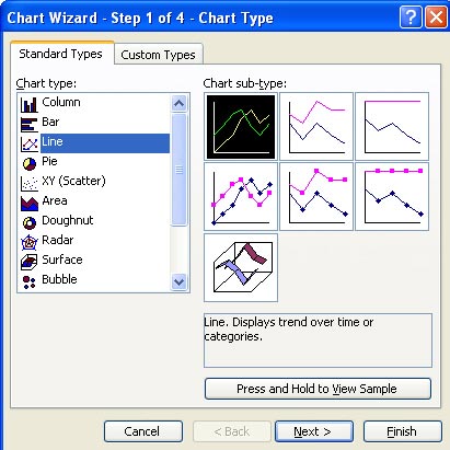
The chart will show one line for this year and one line for last year.
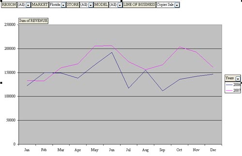
Drag additional fields to the Page Field of your pivot chart. You can then easily query the database. This image shows Copier Sales in California.
The tip in this show is from Pivot Table Data Crunching.