
When do I Use Which Chart Type?
August 01, 2023 - by Bill Jelen

Problem: There are 80 chart types. When should I use which chart type?
Strategy: Here are several examples:
- For time series with equal points, you can either use column or line. People expect time to move from left to right. Use column for 12 points or less, lines for 12 points or more.
- For time series with unequal points or with hours, use scatter.
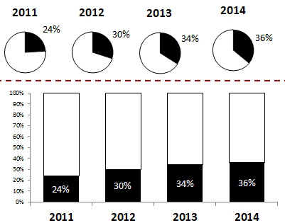
- Don’t use pie charts over time. Instead, use a stacked 100% column chart.
- For comparing sales of products that have long names, a bar chart allows plenty of room for the long text labels along the left axis.
- Never use a pie chart for item comparison. Pie charts should only be used to show how several items add up to 100%.
Excel offers some other chart types that have not been covered.
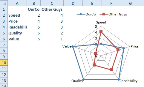
If you have survey data for your company and a competitor, you can plot both results on a single radar chart. This shows the relative ranking for each of the questions.
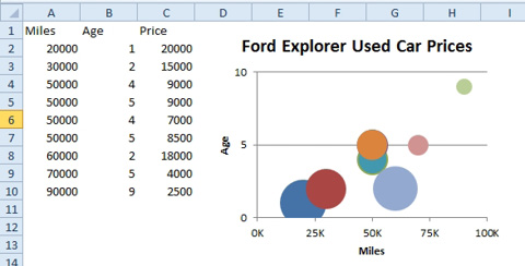
A bubble chart is like a scatter chart, but the size of the point conveys a third bit of data. For example, you might compare miles along the x-axis, age along the y-axis, and price of the car as the size of the bubble.
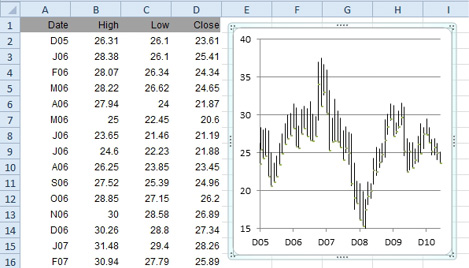
Excel offers four types of stock charts. The name of the chart tells you the order in which the data columns should be arranged.
Excel also offers surface charts and donut charts.
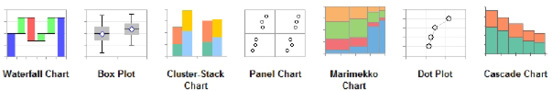
Jon Peltier offers utilities to create a variety of charts:
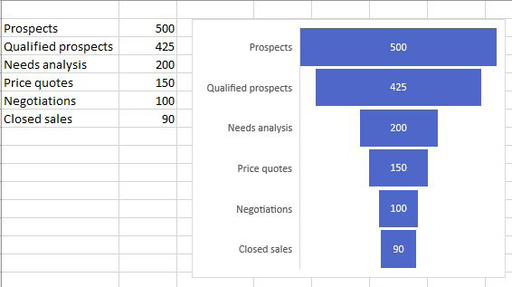
Problem: I need to track a sales pipeline. This is basically a bar chart, but the bars are centered.
Strategy: The February 2016 update of Office 365 includes a funnel chart.
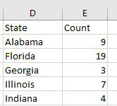
Filled Map charts were introduced in Office 365 in 2017. You can create charts by country, state, county, or zip code. Select data like the data shown here.
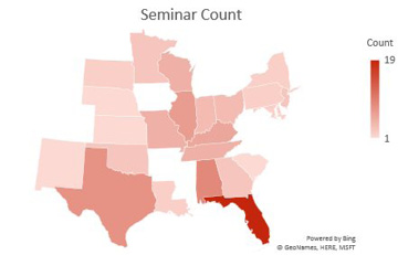
On the Insert tab, choose Map Charts. Excel will insert a chart like this one.
This article is an excerpt from Power Excel With MrExcel
Title photo by Anne Nygård on Unsplash