
Using Maps in Power BI Desktop
May 16, 2023 - by Bill Jelen

Two maps are built-in to Power BI Desktop. There is a regular map and a filled map. Use a regular map to show revenue by city. Use a filled map to show revenue by state or province.
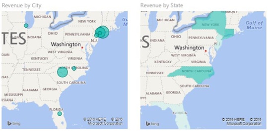
With a regular map, use City for Location and Revenue for Size. If you add Product to the Legend, each circle will turn in to a pie chart.
For a filled map, use State for Location and Revenue for Color Saturation.
This article is an excerpt from Power Excel With MrExcel
Title photo by Aaron Burden on Unsplash