Use Meaningful Chart Titles
July 04, 2023 - by Bill Jelen

Problem: Excel tends to add boring chart titles. A chart title such as Sales or Profit merely labels the data in the chart. The title is nothing more than a legend in a large font. How can I make my chart titles more meaningful?
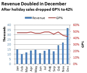
Strategy: It’s a good idea to add a meaningful title that guides the reader. As an analyst, you can spot trends in the data, and you can point out something interesting in the chart by using the title.
One annoying problem is that you seemingly don’t have a lot of control over the chart title formatting. Follow these steps to create a long title:
1. Select Layout, Chart Title, Above Chart. Excel adds the title Chart Title in a large font above the chart.
Gotcha: To edit the chart title, try triple-clicking the chart title. This should select all of the characters in the chart title. Alternatively, drag to select the characters in the chart title. If you just single-click the chart title and start typing, you will only see the title in the formula bar until you press enter.
2. Select the characters in the chart title using the mouse.
3. On the Home tab of the ribbon, choose a 14-point font size. Choose the Left Align icon.
4. Type a title such as Revenue Doubled in December.
5. Press Enter. Excel will move to a second line in the title.
6. Before typing the second line, change the font to 12-point on the Home tab.
7. Type the subtitle Post-holiday sales dropped GP% to 42%.
8. Click on the border of the title to exit Edit mode.
9. Drag the border of the title to the left in order to align the title with the left edge of the chart.
Results: You’ve added a title to guide the reader’s understanding of the chart.

Gotcha: The border around the title has only four handles. This means you can move the title, but you cannot resize it. In step 5, you were able to force the title box to add a second line. However, Excel can have a mind of its own and may decide to add a third line. It would seem that you could correct this if you had the ability to resize the title box. Instead, you would have to select characters within the title and choose a smaller font in order to coax the title back to the correct number of lines. Alternatively, delete the title and add a text box from Insert, Shapes while the chart is selected. You have more control with a text box.
This article is an excerpt from Power Excel With MrExcel
Title photo by Alexander Grey on Unsplash
