Use an Invisible Series to Float Columns
July 24, 2023 - by Bill Jelen

Problem: I need my chart columns to float in the air.

Strategy: This is a common trick. You will have the bars sitting on top of a rogue series and then make the series invisible. Follow these steps:
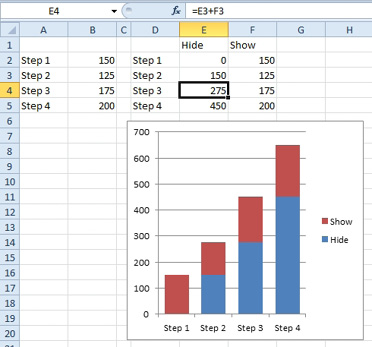
1. Next to your original data, build a new data range that will be used for the chart. You will have two series. You can call them anything, but here I’ve used “Hide” and “Show”.
2. Use formulas to calculate the height of the visible column and the height at which the column should float. Below, Step 3 is 175 tall and is floating 275 in the air. The 275 is the height of the previous two bars.
-
3. Create a stacked column chart.
4. Click on one of the bottom columns to select the Hide series.
5. On the Format tab, open the Shape Fill dropdown and choose None.

6. If the lower columns have an outline, click the Shape Outline dropdown and choose None. The bottom columns will now disappear.
7. Click on the legend and press Delete.
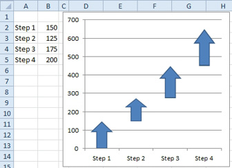
The original figure in this topic used arrows instead of columns. This is easy to do.
1. Use Insert, Shapes, Arrow and draw an upward facing arrow near the chart.
2. Click on the arrow shape to select it.
3. Ctrl+C to copy the arrow.
4. Click on one of the visible columns in the chart. This will select all of the column in the series.
5. Press Ctrl+V to paste. This will replace the columns with the arrows.
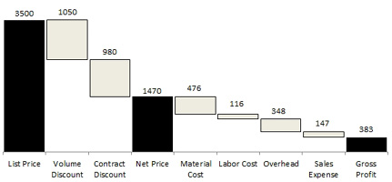
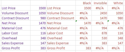
A similar trick is used to make waterfall charts. The black columns are series 1. The white columns are series 3. An invisible series 2 makes the white columns float.
The waterfall chart here uses a hidden series 2 to achieve the basic effect. The data labels are the most difficult part of the chart.
1. .

1. Convert the original source data in the second column to three columns of data as shown here
2. Create a stacked column chart.
3. Format series two to have no fill.
4. Format any one series to have no Gap Width.

5. Select series 1 and add data labels to the center.
6. Select series 3 and add data labels to the center.
It is frustrating that you can not choose Outside End for the data labels. You must manually move each label into position. Follow these steps.
7. Click one label in series 1 to select all labels in the series.
8. Click one label again to select the individual label.
9. Drag the label up to the correct position.
10. Choose the next individual label and drag it.
11. Repeat step 10 for each label.
12. Repeat steps 7-11 for series 3.
This article is an excerpt from Power Excel With MrExcel
Title photo by Janis Fasel on Unsplash
