Three Ways to Build Visualizations in a Report
May 04, 2023 - by Bill Jelen

Some people who were early adopters of Excel 2013 may have experimented with a tool called Power View. Other people using Power BI are long-time Excellers who are used to pivot tables and pivot charts. Others come from the world of SQL Server Analysis Services.
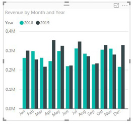
Say that you want to build a chart comparing this year and last year's revenue. There are three ways to start:
- Power View veterans would drag the Revenue field to a blank area of the Reports canvas. This will give you a default chart with a single column.
- Excellers would drag the Revenue field to the Values drop zone. This will give you a one-row table.
- SQL Server people might select Clustered Column and then drag fields to the drop zones.
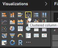
- Any of those methods work fine. Once you have Revenue on the canvas, choose a Clustered Column chart from the panel of visualizations.

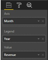
Three icons will appear below the panel. The first icon shows the field drop zones. The second icon allows you to change the formatting of the chart. The third icon lets you add Analytics, such as trend lines or lines showing the average values.

Drag Month from the Calendar table to the Axis drop zone. Drag Year from the Calendar table to the Legend drop zone.

This article is an excerpt from Power Excel With MrExcel
Title photo by Martin Sanchez on Unsplash
