
Sparklines Are Not Scaled Together
August 03, 2023 - by Bill Jelen

Problem: The vertical scale on the sparklines seems to be wrong. This chart is showing that Chicago and Miami have similar January temperatures.
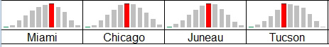
Strategy: by default, each sparkline has its own vertical scale. This works out great when the sparklines are comparing how different items trend together over time.
In Professor Tufte’s first examples, he was comparing unlike variables that had a relationship. This is why Microsoft chose to keep the axes separate for each line.
When you are comparing items that all have the same scale, you have to force the minimum and maximum axis to be the same.
At the very least, use the Axis dropdown and choose Same For All Sparklines for both the minimum and maximum value.
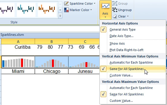
If you are going to be labeling sparklines or shading sparklines as described later, you will want to use a Custom Value for both the min and max value options.
This article is an excerpt from Power Excel With MrExcel
Title photo by Taru Huhkio on Unsplash