
Slicers
August 22, 2017 - by Bill Jelen

Pivot Filters have been around
Slicers provide a visual way to filter. Choose the first pivot table and select Analyze, Slicers. Add slicers for region and line. Use the Slicer Tools tab in the ribbon to change the color and the number of columns in each slicer. Resize the slicers to fit and then arrange them on your dashboard.
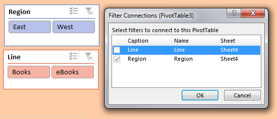
Initially, the slicers are tied to only the first pivot table. Select a cell in the second pivot table and choose Filter Connections (aka Slicer Connections in Excel 2010). Indicate which slicers should be tied to this pivot table. In many cases, you will tie each pivot table to all slicers. But not always. For example, in the chart showing how Books and eBooks add up to 100%, you need to keep all lines. The Filter Connections dialog box choices for that pivot table connect to the Region slicer but not the Line slicer.
Watch Video
- Pivot Filters have been around
- They have to live near the pivot table
- They are awful when you want to select multiple items
- Visual filters were introduced in Excel 2010 as Slicers
- When you insert slicers, they are tiled in the middle of the screen
- You can change number of columns
- Arrange the size
- Change the colors
- Great for multi-select
Video Transcript
Learn Excel from MrExcel Podcast, Episode 2009 -- Pivot Slicers
Hey, I'm podcasting this whole book go ahead and subscribe use that I on the top right hand corner. Welcome back to MrExcel netcast. I'm Bill Jelen.
Yesterday we built this Pivot Chart and today I want to talk about another great feature Pivot Tables called Slicers. Before we talk about Slicers we should talk about the old old way and that's the filter. Alright so you had a Pivot Table. You could filter maybe by Name and Region. Region makes sense to be first. These worked but the filter has to live next to the Pivot Table and the thing I really hated, it is when you select multiple items, it doesn't print on the report. So now I have model item selected, but no one, you know, if I print this out, no one will have any clue which multiple items, ugh, yuck.
Alright so Excel 2010 brought us a great new feature called a Slicer. I had someone come back up here to where my dashboard is going to be Analyzed Tab. I'm going to Insert a Slicer and I want a slicer for Region and for Name. Click OK.
Alright now by default they are always tiled right here in the middle of screen. I always move them and rearrange them. Alright so region has two choices, East and West, it can easily be two columns like this. Doesn't have to be as tall, and will change the color for region. We'll make it fit right there.
Okay and then name, hmm, well I guess I only have 5. I'm just going to let that live right there. I want it to be so big I get a scrollbar. Alright and the way that it works now is if I want to see this report for just East, I click East, or just West, or Everything. And then I could choose one sales rep, I could Ctrl click multiple sales reps. In Excel 2016 they gave us the multi-select. That lets me touch without having to hold down control. Great for a touch screen by the way.
Alright so these visual filters they're much much better than the old, old report filters. you can use them with Pivot Charts or can use one Pivot Tables. Now tomorrow we're going to add a second Pivot Chart and then the day after that I'll show you how to hook these Slicers up to multiple Pivot Tables, Pivot Charts. Great, great dashboarding trick.
Alright, hey please go out buy the book it has everything we're talking about in August and September in the podcast here. Great way to impress your boss.
So recap Pivot Filters have been around for a long time. They always lived near the Pivot Table. They're awful when you want to select multiple items with that multiple items tag. So it excels 2010 they introduced Slicers. The do the same thing. They're visual filters when you insert multiple they're always tiled in the middle of screen but you change the number of columns, change the size, change the colors and they work great, great multi-select.
Alright, so I want to thank you for stopping by we'll see you tomorrow where we'll continue this series on building a dashboard.
Download File
Download the sample file here: Podcast2009.xlsx
Title Photo: Pixabay