Select Anything on a Chart to Format
July 03, 2023 - by Bill Jelen

Problem: I need to further customize a chart. How do I format a series or a single data point?
Strategy: I certainly understand the frustration. The Excel 2010 Layout tab and the Excel 2013 Plus icon offer lots of chart elements to format, but they missed the most important dropdown; the one for series.
You can choose each series from the Current Selection dropdown on the left side of the Format tabs. But the dropdown does not offer each individual point or data label.
The answer is to format anything in the chart by double-clicking.
To select a series, click on the series. If the series is too small to click, then use the Current Selection dropdown on the Layout tab.
To select an individual data point, you have to first select the series then do a second single-click on the data point. You can never choose data points using the Current Selection dropdown.
To add data labels to a chart, make sure that no series is selected. Open the Data Labels dropdown on the Layout tab and choose any item. You can even choose More Options and immediately click OK. The alternative method is to right-click one series and choose Add Data Labels, but this will not add data labels to the other series.
Once you have data labels, click on one label to select all of the labels for that series. Once data labels are selected, click again on one data label to select the label for an individual point.
Additional Details: If you click in a chart and start pressing the right arrow, you will cycle through every element that can be formatted. Watch the Current Selection dropdown to see what you are selecting.
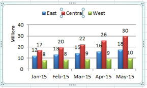
In the chart below, Excel cycles through 46 separate items. In contrast, the Current Selection dropdown only offers 14 items. What is the difference between 46 and 14? The arrow keys will select each individual entry in the legend, each data point, each data label, even the “Millions” tag next to the axis.

Once you have selected something, use Ctrl+1, or the Format Selection button to access the Format dialog box.
Everything on a chart can be customized. You can use any of these methods:
- Right-click the chart element and choose Format
- Double-click the chart element
- Click the chart element to select it and then press Ctrl+1
- Use the arrow keys to select an element and press Ctrl+1
- Choose the chart element from the Current Selection dropdown on Format tab and then click the Format Selection button in the same group
There is no one “right” method of these five. There are times when the only way to format something is by clicking it and other times when something is nearly invisible and the only way you can format it is from the Current Selection dropdown. So you need to be ready to use whichever method will get you to the correct element.
Gotcha: None of the methods described above will let you access an element that is not yet on the chart. Use the dropdowns on the Layout tab to add elements such as Chart Title, Axis Title, Data Table, Error Bars, Drop Lines, Up/Down Bars, Trendlines.
Say that you want to change the color of just the May central region column. The first click on the central region column will select all of the central region columns. A second single-click will select just the one column. You right-click to access Format Data Point.
This article is an excerpt from Power Excel With MrExcel
Title photo by Nathan Fertig on Unsplash
