See Detail on Large & Small Data Points
July 12, 2023 - by Bill Jelen

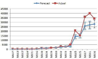
For our monthly sales and operations planning meeting, I plot the forecast and actual for 30 model lines. Some of the models sell 30,000 a month and some sell 300 a month. No one can make out the detail on 80% of the models.
Strategy: Use a Log scale. In a Log scale, the distance from 10 to 100 is the same as the distance from 1,000 to 10,000. This lets you zoom in on the smaller items.
1. Choose Layout, Axes, Primary Vertical Axis, Show Axis with a Log Scale.

The first two gridlines on the chart include no data points. Because the purpose of the chart is to see if the forecast was within 15% of the actuals, it would help to zoom in. Double-click the numbers along the vertical axis to access the Format Axis dialog.
-
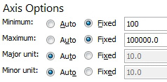
2. Change the Minimum and Maximum from Automatic to Fixed. Enter 100 as the Minimum and 100000 as the Maximum. By the way, the Major Unit and Minor unit control where the gridlines will be drawn.

3. The markers are too large for this chart. Choose each series. In the Format Series dialog choose Marker Style and either None or a smaller size for the marker.
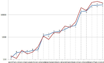
4. To help the reader’s eye travel from the label to the point, use Layout, Lines, Drop Lines. Select the drop lines. Use Format, Shape Outline. In this dropdown, choose Dashes and color to make the lines less prominent.
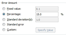
5. The Error Bars are showing ±15% from the forecast. To set these up, choose the Forecast series. Use Layout, Error Bars, More Error Bar Options. Choose Both for the direction. Choose Percentage, 15%.

Result: You have a chart to review at the sales and operations planning meeting. Any time that the sales team’s forecast was not within 15%, have a discussion about what happened.

This article is an excerpt from Power Excel With MrExcel
Title photo by Guzmán Barquín on Unsplash
