
Open Source Visualizations
May 11, 2023 - by Bill Jelen

You've been stuck with the same 73 chart types in Excel for two decades. You won't have that problem in Power BI. The product is open source - developers can invent and design new visualizations. You can download the visualization and add it to your dashboard.
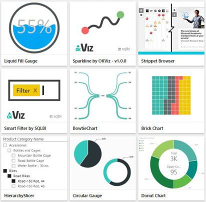
The URL for custom visualizations has changed frequently, so simply do a search for Power BI Custom Visualizations. You should find yourself at a gallery of free visuals that you can download. Microsoft has promised to add a new visual every week.
Here are a few of the options as of November 2016:
To use one of these visualizations, click on it in the browser. You will see information about the author, the release date, links to support, and a button to download the visual.
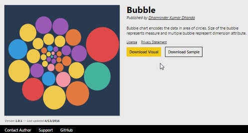
Download the visual. A warning will appear that the visual does not come from Microsoft. Read the license rules and then download. A *.pbiviz file will download.
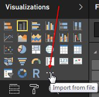
Back in Power BI, click the Elipsis near the visualization types. Browse to the PBIVIZ file you just downloaded and import the visual.
The visualization will appear in the list.
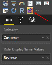
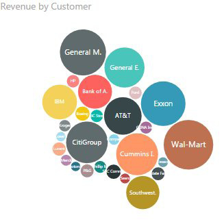
The author of the visualization specified that you can provide a Category and a Role DisplayName Values. While those might be unusual titles, guess that Customer goes in the top field and Revenue goes in the bottom field.
The chart will show larger circles for large customers and smaller circles for small customers.
Click on the South Region column in one chart and the new Bubble chart will be filtered to show only the South region customers.
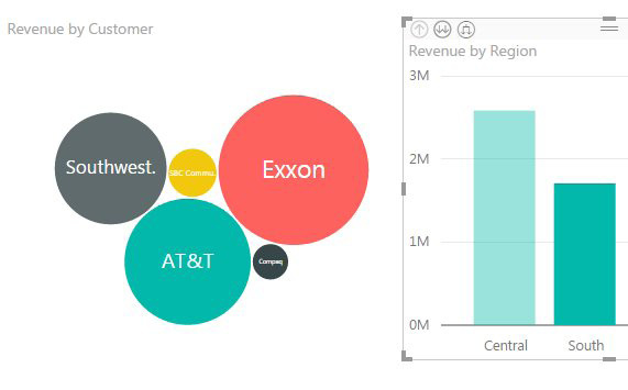
To turn off this behavior, go to the Format Tools tab in the Ribbon and use Edit Interactions.
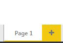
A Report Can Have Multiple Pages
Look at the bottom of the Power BI Desktop screen. You can see that you are working on Page1. Right-click the tab to rename it. Click the + tab to add a second sheet to the Report.
This article is an excerpt from Power Excel With MrExcel
Title photo by Katerina Pavlyuchkova on Unsplash