Move Small Pie Slices To Second Chart
July 10, 2023 - by Bill Jelen

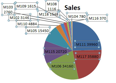
Problem: All of the tiny pie slices really make the chart hard to comprehend.


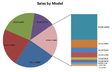
Strategy: Excel offers two chart types that will take the small wedges to a secondary chart. To make these look right, you should always plan on tweaking the settings.
Choose the pie chart. Select Design, Change Chart Type. Choose the Bar of Pie icon.

Double-click the secondary chart and choose Format. You have choices on how Excel will split points to the secondary axis. The first dropdown offers Position, Value, Percentage Value, and Custom. With custom, you can choose each data point and specify if it is in the first or second plot. An easier choice is to choose Percentage Value. Move everything that is below 10% to the secondary plot.

You can control the size of the secondary plot. It starts at 75% of the size of the pie. If those small slices are unimportant, make it smaller. However, if you need to see the detail of those small items, you can go up to 200% of the size of the pie chart.

Gotcha: I had to choose individual labels near the bottom of the column and resize just those labels to prevent overlapping. To select individual labels, you can click one label to select all labels, then a second click to select one label. Then, use the right arrow key to move from label to label.
This article is an excerpt from Power Excel With MrExcel
Title photo by Diana Polekhina on Unsplash
