Legend At the Top
June 26, 2023 - by Bill Jelen

Problem: Excel always adds a legend on the right side of the chart. Visualization gurus say the legend should be at the top or left of the chart. You don’t even need a legend for a one-series chart.
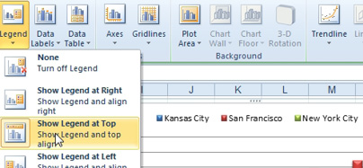
Strategy: Use Layout, Legend, Show Legend at Top.

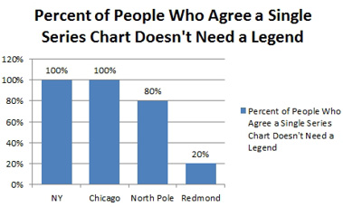
When you have an Excel 2010 chart with a single series, Excel adds the series name as both the title and the legend. This is definitely overkill. Click the Legend and then press the Delete key on your keyboard. This is fixed in Excel 2013 - a chart with a single series will not have a legend.

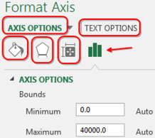
If you would double-click any chart element a Task Pane appears on the right side of the screen. The task pane is labelled with a series of icons.
My general rule: always start with the Column Chart icon - the best choices are often there.

This article is an excerpt from Power Excel With MrExcel
Title photo by Jess Bailey on Unsplash
