Labeling Sparklines
August 07, 2023 - by Bill Jelen

Problem: I want to add labels to a sparkline.
Strategy: Labels are not built in to sparklines, but you have cells above, below, left and right of each sparkline. If you increase the column width and row height, you can create some interesting labels.
Below, titles appear above each sparkline. Those cells are just text that you can type in the cell and center. The axis max/min to the left is created by typing 100 Alt+Enter, Alt+Enter, Alt+Enter, 0. Make the font small and then adjust the row height until the numbers fit.
For the month labels below the chart, use a fixed-width font like Courier or Courier New. Type each month letter separated by a space. Make the font as small as possible. Center the values. Make the column width wider until the labels line up with the chart.

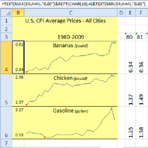
In the figure to the right, a formula calculates the max and min of each series. The REPT(CHAR(10),4) adds four line feeds. With a row height of 55 and an 8-point font, this works out fine.
The background for sparklines are transparent so that any text in the cell will appear behind the sparkline. The title for each sparkline is just text typed in the cell, vertically aligned to the top of the cell.
In the figure below, a sparkline column chart shows hourly readings from 7AM to 2PM. Because the label for 12 would be twice as wide as the label for 7AM, a bit of trickery is employed. The label is 7 followed by Alt+Enter, 8 followed by Alt+Enter, 9 followed by Alt+Enter, and so on through 2. Use the Alignment tab of the Format Cells dialog to turn the values sideways, vertical align top, horizontal align center. Back in the Home tab, keep reducing the font and/or adjusting the column widths until all the values show in the cell.


This article is an excerpt from Power Excel With MrExcel
Title photo by Helena Hertz on Unsplash
