Interactive Chart to Show One Customer
July 19, 2023 - by Bill Jelen

Problem: We have a monthly meeting to review accounts. They want one chart per customer that we can review at the meeting.
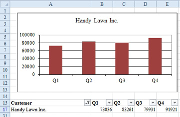
Strategy: Build one chart showing all customers, but then hide all customers but one using a filter. By default, when you hide rows in the worksheet, they get hidden in the chart.


During the creation of this chart, the chart looks bad, then really bad. It finally makes sense in the last step.
1. Select your range of customers and sales.
-
2. Insert a clustered column chart.
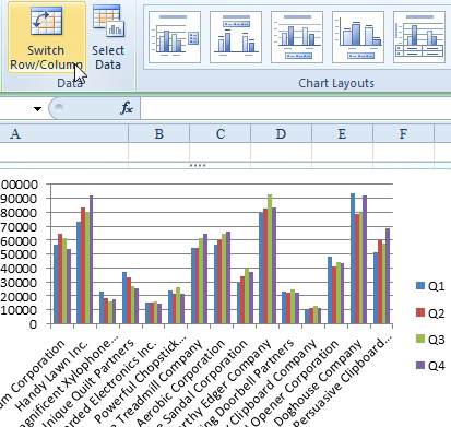
3. Excel will assume you want customers in the legend and quarters along the axis. Click the Switch Row/Column icon.

At this point, your chart will be unreadable. You are one step away from having a good chart.
4. If you’ve added Filter by Selection to the Quick Access Toolbar, you can select one customer in the worksheet and click Filter by Selection. Otherwise, select a customer, use Data, Filter, then open the customer dropdown and choose one customer.
5. Because the chart now has one visible series, you get the name of that series in both the title and the legend. Click the legend and press the Delete key to remove the redundant information.
6. You can now choose a customer from the dropdown and the chart will update to show the new customer.
Again, this trick takes advantage of the default behavior that the point in the chart will be hidden when the row or column in the worksheet is hidden.
This article is an excerpt from Power Excel With MrExcel
Title photo by Алекс Арцибашев on Unsplash
