
Hide Subtotals From Chart in Excel 2013
July 13, 2023 - by Bill Jelen

Problem: My data has subtotals that cause spikes in the chart.
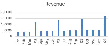
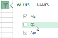
Normally, you would create another range with the monthly data and create a chart from that range. But, Excel 2013 introduces the Funnel icon to the right of the chart. Click the Funnel and you can uncheck certain data points.
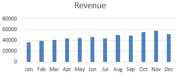
The result: a monthly chart:
Create Pivot Charts from Detail Data
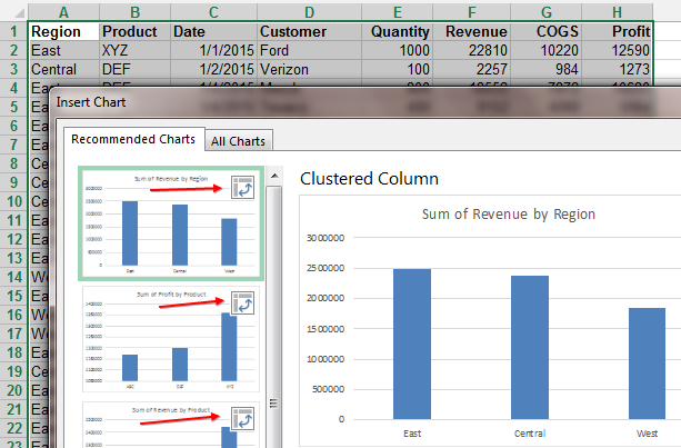
Say that you have hundreds of rows of detail data. Select the entire data set and use Insert, Recommended Chart. Excel will recommend that you let it create pivot charts to summarize the data. You will see tiny Pivot icons on each chart tile.
This article is an excerpt from Power Excel With MrExcel