
Formatting a Chart
May 05, 2023 - by Bill Jelen

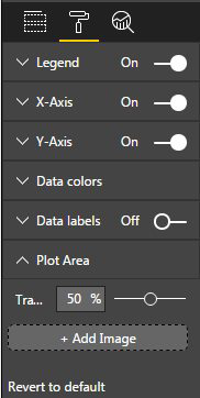
Power BI Desktop offers a lot of formatting choices. The second icon at the top of the drop zones allows you to format the chart. Although Legend appears with a single control for On or Off, if you click the V to the left of the word Legend, the choices will expand to offer many other settings.
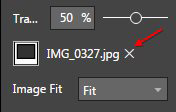
Feel free to experiment with the settings. I thought it might be cool to add an image behind the plot area in my chart. But then I realized it was not that cool. Use the "X" to remove the image.
When Power View debuted in Excel 2013, I complained that the available formatting was terrible. Kudos to the Power Bi Desktop team for building out a wide variety of formatting choices.
This article is an excerpt from Power Excel With MrExcel
Title photo by Jess Bailey on Unsplash