
Excel 2020: Show Up/Down Markers
May 28, 2020 - by Bill Jelen

There is a super-obscure way to add up/down markers to a pivot table to indicate an increase or a decrease.
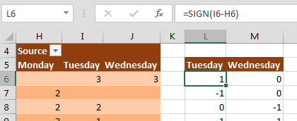
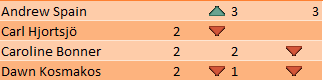
Somewhere outside the pivot table, add columns to show increases or decreases. In the figure below, the difference between I6 and H6 is 3, but you just want to record this as a positive change. Use SIGN(I6-H6) to get either +1, 0, or -1.
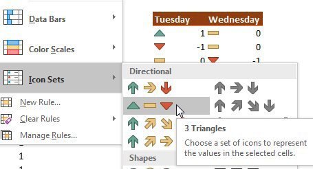
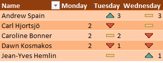
Select the two-column range showing the sign of the change and then select Home, Conditional Formatting, Icon Sets, 3 Triangles. (I have no idea why Microsoft called this option 3 Triangles, when it is clearly 2 Triangles and a Dash, as shown below.)
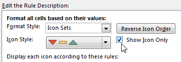
With the same range selected, now select Home, Conditional Formatting, Manage Rules, Edit Rule. Check the Show Icon Only checkbox.
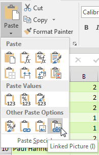
With the same range selected, press Ctrl+C to copy. Select the first Tuesday cell in the pivot table. From the Home tab, open the Paste dropdown and choose Linked Picture. Excel pastes a live picture of the icons above the table.
At this point, adjust the column widths of the extra two columns showing the icons so that the icons line up next to the numbers in your pivot table, as shown below.
After seeing this result, I don‘t really like the thick yellow dash to indicate no change. If you don‘t like it either, select Home, Conditional Formatting, Manage Rules, Edit. Open the dropdown for the thick yellow dash and choose No Cell Icon, and you get the result shown below.
Title Photo: Casey Schackow at Unsplash.com
This article is an excerpt from MrExcel 2020 - Seeing Excel Clearly.