Excel 2016 Adds a Waterfall Chart
July 21, 2023 - by Bill Jelen

Problem: I need to create a waterfall chart.
Strategy: Excel 2016 introduced a waterfall chart. It is great at handling columns that cross the zero axis. It offers the connectors between columns. But it is a little difficult to change the colors.
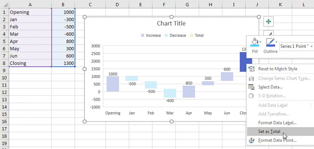
When you initially select your data and insert a waterfall chart, none of the columns are marked as Total columns. This means that all of the columns will be floating.
Click on the first column that should be a total. All of the columns will be selected. Click on the same column a second time. Only that one column will be selected. Right-click the column and choose Set as Total.
Gotcha: You will notice in the figure below that you can change the Fill and Outline of each individual point. If you want your waterfall to appear in the universal colors of Green for positive and red for negative, you might be tempted to right-click each column and manually change the colors. Don’t do this! If the data changes from positive to negative, the colors won’t change. Further, the legend will stay with the original colors of blue, teal, and green. It will be a confusing mess.

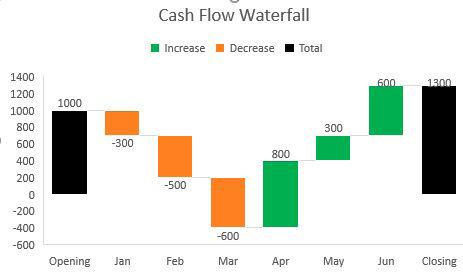
Instead, go to Page Layout tab. Open the Colors dropdown. At the bottom, choose Customize Colors. While looking at the chart legend and the Create New Theme Colors dropdown, you can tell that Accent 1 color is used for Increase, Accent 2 is used for Decrease and Accent 3 for Total. Change these three colors and the colors in the Waterfall Chart will change. Hope that nothing else in your workbook has charts or relies on theme colors.

Each column is connected to the next column by a thin grey connector line. To see these lines, it might help to hide the chart gridlines. Click on one of the middle chart gridlines to select all gridlines. Press the Delete key. You can now clearly see that the connector lines are there, but are a faint grey. If you attempt to format the connector lines as black 3 point, you will quickly see that the connector lines and the column outlines share the same setting. So, for all practical purposes, the only way to make them darker is with a Sharpie after printing.
The Waterfall chart is one of 7 chart types designed on the new Ivy charting engine. This engine is supposed to be better, but so far, it offers a disappointing lack of customizable features.
This article is an excerpt from Power Excel With MrExcel
Title photo by Joshua Sortino on Unsplash
