
Dashboard Sparklines
August 23, 2017 - by Bill Jelen

Sparklines are word-sized charts
Professor Edward Tufte introduced sparklines in his 2007 book Beautiful Evidence. Excel 2010 implemented sparklines as either line, column, or win/loss charts, where each series fills a single cell.
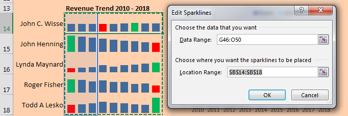
Personally, I like my sparklines to be larger. In this example, I changed the row height to 30 and merged B14:D14 into a single cell to make the charts wider. The labels in A14:A18 are formulas that point to the first column of the pivot table.
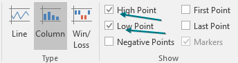
To change the color of the low and high points, choose these boxes in the Sparkline Tools tab:
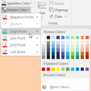
Then change the color for the high and low points:
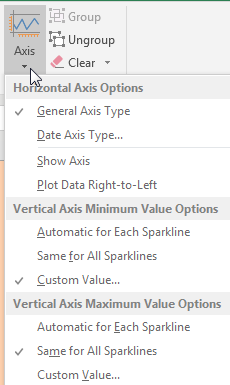
By default, sparklines are scaled independently of each other. I almost always go to the Axis settings and choose Same for All Sparklines for Minimum and Maximum. Below, I set Minimum to 0 for all sparklines.
Making Excel Not Look Like Excel
With several easy settings you can make a dashboard look less like Excel.
- Select all cells and apply a light fill color to get rid of the gridlines.
-
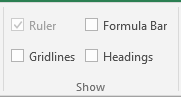
On the View tab, uncheck Formula Bar, Headings, and Gridlines.
View Settings - At the right edge of the ribbon, use the ^ to collapse the Ribbon.
- Use the arrow keys to move the active cell so it is hidden behind a chart or slicer.
- Hide all sheets except for the dashboard sheet.
-
In Excel Options, Advanced, you can hide the scrollbars and sheet tabs.
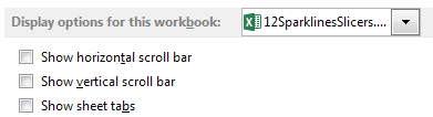
Display Options
- Sparklines are word-sized charts
- See the book Beautiful Evidence by Edward Tufte
- Use Sparklines to fit data in a small space
- Build a second pivot table from the original data
- Put the data for the sparklines in the pivot table
- Remove the grand totals from the pivot table
- Select the numbers for the sparklines
- Choose Insert, Sparklines, Column
- Select where you want the sparklines to go
- Make the column wider to make the sparklines larger
- You can also make the row height taller
- You can even (gasp) merge cells to make the sparklines wider
- Change the color of the high and low point
- If you want the sparklines to be scaled together, change the axis minimum and maximum
Download File
Download the sample file here: Podcast2010.xlsx
Title Photo: PublicDomainPictures / pixabay