Create Pivot Charts
January 09, 2023 - by Bill Jelen

Problem: Can I show the results of a pivot table in a chart?
Strategy: Pivot charts have improved to the point where they are actually usable. Here’s what you do:
1. Select a single cell in your data. Select Insert, PivotTable dropdown, PivotChart.
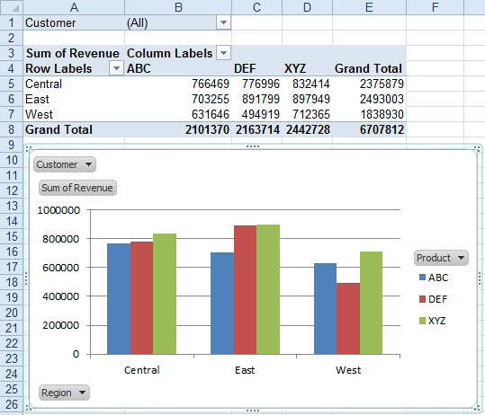
2. Build a pivot table by using the Field List dialog. Note that the row fields are now called axis fields. Put Region in the Axis Fields drop zone.
-
3. Column fields are now called legend fields. Put Product in the Legend Field drop zone.
4. Add Customer to the Report Filter drop zone.
5. Add Revenue to the ∑ Values drop zone.
Excel will show both a pivot table and a chart on the worksheet. When you select the chart, you can use the PivotChart Tools tabs on the ribbon to control the chart type and all formatting.

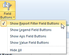
Gotcha: The button on the chart went away in Excel 2007 and came back in Excel 2010. Excel 2007 offered a PivotChart Filter Pane with the filter dropdowns. If you liked the cleaner look of a pivot chart without buttons, you can use the dropdown on the Excel 2010 Analyze tab to remove selected buttons.

Additional Details: To filter the chart to a specific customer, you can change the Customer dropdown in the pivot table.
Gotcha: The Show Report Filter Pages trick (described in Create a Report for Every Customer) doesn’t work for a pivot chart.
This article is an excerpt from Power Excel With MrExcel
Title photo by Алекс Арцибашев on Unsplash
