Conditional Format a Chart
July 27, 2023 - by Bill Jelen

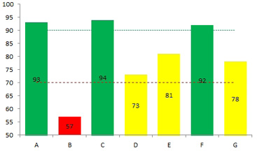
Problem: I want the chart column to be green for ratings of 90 or above, yellow for 70 to 90 and red for less than 70. Can I do conditional formatting in a chart?

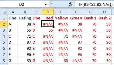
Strategy: Charts don’t support conditional formatting (yet). However, you can use formulas to separate your data into three series, one series for red, one series for yellow, and one series for green. Only one series will be filled for each category. The other series will be #N/A.
The formulas below break the value in column B into one of three series in D, E, or F. Each value in B goes to exactly one cell in D:F.

The formulas used to create the table above are shown below.

When you create the chart, create a stacked column chart. You will have to select each series and use Format, Shape Fill to choose the correct color.
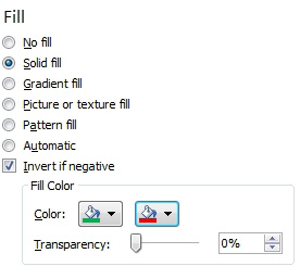
If you need one color for positive and another color for negative, you can use a regular column chart. Format the series. On the Fill category, choose Invert if Negative. you can choose Green for the first color and red for the second color.

This article is an excerpt from Power Excel With MrExcel
Title photo by David Pisnoy on Unsplash
