
Chart Two Series with Differing Orders of Magnitude
July 14, 2023 - by Bill Jelen

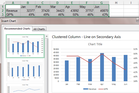
Problem: I’m trying to create a combo chart that shows revenue and gross profit percentage. In Excel 2010, the legend shows that both items are in the chart, but I can see only the Revenue series on the chart.
Strategy: Excel easily handles this with their Recommended Charts feature. Make sure the gross profit percent series is formatted with a % format. Select the data. Go to Insert, Recommended Charts. Excel will offer a Clustered Column - Line on Secondary Axis chart:
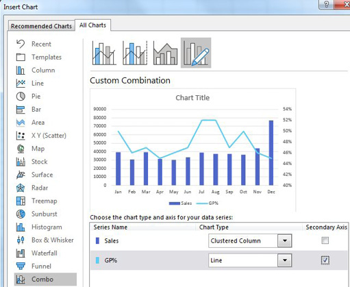
Starting in Excel 2013, a new interface for creating combo charts is available. For each series, you can choose the chart type and choose which series should be on the secondary axis.
This article is an excerpt from Power Excel With MrExcel
Title photo by Ruth H Curtis on Unsplash