Avoid 3-D Chart Types
July 05, 2023 - by Bill Jelen

Problem: I like the look of 3-D chart types, but they don’t seem to be accurate.
Strategy: 3-D chart types are not accurate, so you should try to avoid them. The 3-D effect usually ends up introducing errors into the chart.
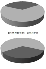
Have you ever taken a photography class? The problem with a wide-angle lens is that anything in the foreground appears unusually large. 3-D pie charts have the same problem. The wedges at the front of the chart get more pixels than the wedges at the back of the chart. For example, both charts below are plotting the same data. This organization is spending 34% of its budget on administration. If you are the scientific review board, trying to argue that the administration slice is too large, rotate it around to the front, as in the bottom chart. In the bottom chart, 155% more pixels appear in the administration slice than in the research slice.

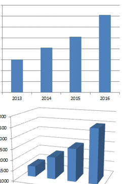
3-D column charts are not accurate, either. In the top chart below, you can see that each column is above a nearby gridline. Turn that chart into a 3-D column chart, and none of the columns actually extend to the neighboring gridline. People wonder if they should look at the front or the back of the column. I say it doesn’t matter because neither the front nor the back reach to the gridline.

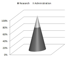
You should never use cone or pyramid charts. The categories at the top of each cone get far fewer pixels than the categories at the bottom. In the next figure, the 34% spent on administration seems practically nonexistent.

This article is an excerpt from Power Excel With MrExcel
Title photo by Afif Ramdhasuma on Unsplash
