Add Lines using Analytics
May 08, 2023 - by Bill Jelen

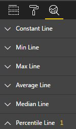
Use the Analytics icon to draw dynamic lines on your chart. You can add a line to show the average or at 80% percentile or a line at a constant value.

After you are finished formatting your first chart, you need to click in the blank area of the canvas to deactivate that chart. You can now being building your next visualization just like you built the first visualization.
Gotcha: When you have several visualizations on the page, you have to click on a visualization before you start using the tools at the right side of Power BI Desktop. I frequently have problems with this. I will start focusing on Chart 3, figuring out what to do next and start moving fields around before activating the chart.
Gotcha: Don't click to add a visualization without unselecting the previously active visualization. Otherwise, you will change your nice column chart to a map chart or whatever you are trying to build next.
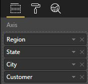
It is very easy to build a hierarchy chart so people can drill-down in to the chart. Start by building a column chart by Region. Then, drag lower levels into the Axis drop zone. After the second field is added, the chart will show a Drill-Down mode indicator.

Initially, the chart only shows data at the Region level. As you drill down, you can see States within a region, then Cities within a state, the Customers within a city.
This article is an excerpt from Power Excel With MrExcel
Title photo by Erik Eastman on Unsplash
