Is it possible to have a floating box showing limits in a scatterplot?

msampson

Board Regular
Joined
Mar 9, 2004
Messages
131
Office Version
  1. 365
Platform
  1. MacOS
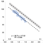
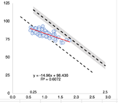
I want to use a scatterplot to show points with x and y values (not categories, but numbers). I want to add to the plot a dashed line plus a grey box (the dashed line 4% higher and lower) that show the allowed slope line with a confidence interval around it. The point being the scatterplot points you add for your sample method should have a least squares linear regression line that is within the 4% zone around the reference method slope (dashed line).
I can easily put the dashed expected line on the plot but I can't figure out how to do the shaded box. I found a tutorial for one, but it uses a stacked area plot which has a categorical x axis which doesn't line up with a numerical x axis.
I uploaded an image. But what I need is the black dashed lines to be on top of each other (one would then not be shown). The first method matches the reference. The second doesn't (see red regression line).
 

Attachments

  • Screenshot 2025-02-05 at 1.04.48 PM.png
    Screenshot 2025-02-05 at 1.04.48 PM.png
    48.3 KB · Views: 7
  • Screenshot 2025-02-05 at 1.11.20 PM.png
    Screenshot 2025-02-05 at 1.11.20 PM.png
    52.3 KB · Views: 7

Excel Facts

Can you sort left to right?
To sort left-to-right, use the Sort dialog box. Click Options. Choose "Sort left to right"
It's not clear for me what you want to achieve. If you are talking about confidence range for fitted regression line, it shall have a hourglass-like shape, not stright line.
Moreover it shall be on both sides of fitted regression line.

May be the below sheet will give you some inspiration how to obtain fitted line parameters and how to draw a shifted* down and up lines on the scatterplot. The extra lines series are based on d8:D9 as X and resp. F8:F9 in one case and G8:G9 in second case for Y.

*) (and it is just a sample, where +/- 4% relates a constant in regression line equation - use your value for this shift - may be from t-distribution, or ... something else)

forum20250209.xlsx
ABCDEFGH
1xytrendline
212083-0,81276177,3843
311084
411087
510590upper and lower lines
610098xyy1y2
710095deduct 4%add 4%
8991009996,921589,82613104,0169
912079,8536472,7582786,94901
10
11
12
Sheet1
Cell Formulas
RangeFormula
D2:E2D2=LINEST(B2:B8,A2:A8)
D8D8=MIN(A:A)
E8:E9E8=D8*D$2+E$2
F8:F9F8=E8-4%*E$2
G8:G9G8=E8+4%*E$2
D9D9=MAX(A:A)
Dynamic array formulas.


So generated two lines look as follows:
1739196271512.png


and indeed making a combi plot with scatter and stacked area
 
Upvote 0
thanks for the input. I use the approach you showed all the time to add lines to charts. What I couldn't seem to do was to combine a scatter plot with a stacked area. The stacked area wants to have a categorical x axis. The drop lines and high low lines are greyed out. I may be going about that the wrong way.
 
Upvote 0
OK, Let's do combined stacked area with scatter step by step.
1739218458866.png


1) Start with stacked area limits - lower bound and width. Format categories as your X values. Adjust axes limits to final values to fit box and data.
2) add third series from just two points of real data.
3) change type of this series as scatter. Set it on secondary axis. Swithch on displaying secondary horizontal axis (by default excel will show only secondary vertical).
4) edit scatter series to include all Y values, use also X values.
and you are basically just two steps away from final result:

1739218932123.png


5) change axis tickmarks position for main horizontal axis (stacked area) to be on tickmarks. Adjust limits for both secondary axes to be the same as primary. I formatted here a bit "box area" asnd scatter plot by adding trend and displaying equation and r squared,
6) select primary horizontal axis. press delete. select secondary vertical (right) axis and set crossing with horizontal at minimum value (you must write it yourself). Once it's done (not shown) you can select this axis and press delete. I also formatted first area as transparent,

And ... here we are :-)

Just in case - My sheet:

forum20250209.xlsx
ABCDEFG
1xy
212083-0,81276177,3843009
311084
411087X lower boundwidth (to be stacked)
5105909593,0771545414,19074407
61009812568,6944889614,19074407
710095
899100
Sheet1 (2)
Cell Formulas
RangeFormula
D2:E2D2=LINEST(B2:B8,A2:A8)
E5:E6E5=D5*D$2+E$2-4%*E$2
F5:F6F5=8%*E$2
Dynamic array formulas.
 
Upvote 0

Forum statistics

Threads
1,226,453
Messages
6,191,136
Members
453,642
Latest member
jefals

We've detected that you are using an adblocker.

We have a great community of people providing Excel help here, but the hosting costs are enormous. You can help keep this site running by allowing ads on MrExcel.com.
Allow Ads at MrExcel

Which adblocker are you using?

Disable AdBlock

Follow these easy steps to disable AdBlock

1)Click on the icon in the browser’s toolbar.
2)Click on the icon in the browser’s toolbar.
2)Click on the "Pause on this site" option.
Go back

Disable AdBlock Plus

Follow these easy steps to disable AdBlock Plus

1)Click on the icon in the browser’s toolbar.
2)Click on the toggle to disable it for "mrexcel.com".
Go back

Disable uBlock Origin

Follow these easy steps to disable uBlock Origin

1)Click on the icon in the browser’s toolbar.
2)Click on the "Power" button.
3)Click on the "Refresh" button.
Go back

Disable uBlock

Follow these easy steps to disable uBlock

1)Click on the icon in the browser’s toolbar.
2)Click on the "Power" button.
3)Click on the "Refresh" button.
Go back
Back
Top