Hello Everyone,
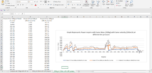
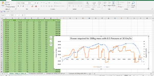
I am working on a project, and I got some values from my real experiment and created a graph. The feedback I received on that graph is that the message I want to convey is not clear from the graph.
I am requesting that you please spare a few minutes to look into it, and if possible, share some real example sheets to plot this big data. Here I am attaching the sheet for reference.
Your any help would be appreciated; thank you in advance.


