Jeffrey021286
New Member
- Joined
- Nov 16, 2021
- Messages
- 6
- Office Version
- 365
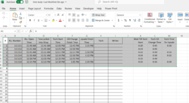
I am doing a time study to see how impacted our express oil change department is when they upsell additional services to customers and are having to do something other than work on oil changes. what i would like to do is use time stamp data to produce a line graph showing the number of people in our 8 man crew alible to do oil changes wile others are doing up sales that they have sold on top of the oil change they where doing. column F in the picture would be the time someone would be starting up sale work and column G would be the time that they finish and would again be available to do oil changes again. as you can see from the example in the picture on line 4 at 12:37 i would loose 1 person then another at 12:45 on line 2 and a 3rd at 12:50 on line 5 then they would free up again for oil changes at 1:10, 1:15, and 1:22. is it possible to make a linier time line graph pulling from this data to be able to visualize the reduced manpower though out the day?


