Hi team,
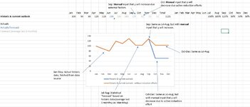
I have created a quite basic overview tool in Excel where assigned people should populate what they think the outcome of some event is, e.g. number of monthly obsolete ice creams in an ice cream truck. The base "forecast" for future months is the average outcome of the past 3 months, and the user can either report increases or decreases based on the best knowledge available - in order to visually represent the forecast without (orange line) and with reduction efforts (blue line). Reduction efforts could be, in this case, e.g. by buying smaller ice cream batches, better sales forecasting, buying a better fridge, etc.
Questions:
- What is the easiest way for users to perform such input in Excel? Currently, I use 12 rows to the right of months with default value = 1 (100%) which users could manually change to reflect changes in absolute values. But I suspect it's not an ideal approach directly... (asking as there will be hundreds of such rows as in this example)
- How to most easily capture and display the orange line, assuming we want to avoid users having to populate two rows per item? The blue one is easy as it incorporates all forecasted input, while the orange one needs to exclude the reduction efforts in a smart way with some mechanism. How to best go about this?


