I am pretty new to Power BI so sorry if this is a stupid question, but I can't seem to find an answer with my Googling.
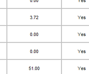
I have a dataset that quantifies how much money we have saved customers by certain initiatives. In it there is a column with a date when the savings started and a separate column with the savings amount. These savings are recurring month over month and we count them towards our ROI with the customer for 12 months. So my question is how can I make a graph in Power BI that shows this, when all I have is the 1st month and the amount?
For example, a savings that was input 3 months ago would show in the bar chart total on each of the 3 months even though it is just 1 line item in the data. A savings that was input 15 months ago would show for 12 months, and then would need to fall off after that.
Does that make sense what I'm asking? I'm stuck on this one.
Thanks!


