Form View doesn't match Design View - Forced to Scroll When Unnecessary

AlexB123

Board Regular
Joined
Dec 19, 2014
Messages
207
Hi all,

I've been studying form properties, and can't find what is causing this issue. In Design View, all my buttons can be seen on a single page without the need to scroll. When I open up the Form View, there is a large bar of whitespace where my bottom buttons should be ... I can scroll down to see them, but I want the buttons readily viewable for users.

I couldn't post images, but here is a general outline, if the letters are labels and the brackets are buttons:

Design View: Form View:
--------- --------------
| xyz | | xyz |
| [ ] | | [ ] |
| abc | | abc |
| [ ] | | [ ] |
| stu | |-------------|
| [ ] | |white space|
---------- --------------

Thanks!
 

Excel Facts

How to total the visible cells?
From the first blank cell below a filtered data set, press Alt+=. Instead of SUM, you will get SUBTOTAL(9,)
More info on the form. Anything you think might be relevant, but especially what type it is. Single? Continuous? Sub form on a main form? Probably not a data sheet form.
 
Upvote 0
Hi, sorry for not responding immediately...

The form is a Single Form. It does not display any data. It has 24 command buttons, grouped in fours around a text box that accepts specific criteria, with two buttons on the left working on a date range, and two similarly functioning buttons on the right that work on a single date.

At the top, on the left side of the form, there are two text boxes for a start date and an end date. At the top, on the right side of the form, one text box accepts a single date. All of the command buttons and functions are all working.

Many of the buttons aren't used, or rarely so, but I had a requirement to add more report choices. So I followed the same layout and design, and added eight buttons to the bottom of the form in design view (there were 16 buttons previously, now a total of 24).

At the moment I have to design and code in a copy of the current database, then login when no users are working and apply the same changes to the production db. When I designed the updated form, I was able to see every button (without scrolling) in Form View. However, when I made the changes in the production database, everything appears the same in Design View, but only displays the top 20 buttons (and forces scrolling) in Form View --- so maybe I fat fingered something or accidentally set some property when I implemented the changes?

Some properties:
Allows form view, but not Datasheet or Layout View.
Auto center is set "No"
Auto resize is set "No"
Fit to screen is set to "No"
Border Style is "Sizable"
Scroll Bars are "Vertical Only"
Moveable is "No"
Layout for Print is "No"
Orientation is "Left-to-Right"

There is a FormHeader at the top, which displays the caption of the form and a logo.

Is there any other info I can provide? How can I be more specific?
 
Upvote 0
Would you consider using a listbox or combobox (possibly with a single command button) instead of so many separate command buttons, as a way to choose an action to run? That should result in a better UI without so much on it.
 
Upvote 0
Pretty sure that even without seeing your form, there's way more on it than what's really required, which just serves to add overhead. That being said, the nature of your posted problem may be that you added the additional buttons in the form footer, which can be visible in design, but out of range in form view, hence the need to scroll.

I have to believe that as xenou is suggesting, this can be less cluttered and more efficient. For example, there may be the possibility that the user has had to make a selection of some sort to open this form. If so, a choice can be made at that time - date range or single date? Then the form opens with the end date field disabled or not (you should only have 2 fields for dates IMHO) and you deal with that. The OpenArgs property of the opened form can be used to distinguish between the 2 options (or just about any other parameter you can think of). Or, an option group in an option frame on your form can be used to make any choices pertinent to the group, such as date range or not, which of several reports, which of other forms get opened, etc. The suggestion to use a combo or listbox for selecting a report to open is a good one - each have their advantages. You probably ought to have a table of reports so you can easily maintain a list for the control you use to display that list.
 
Upvote 0
Micron, xenou,

Thank you both! I will absolutely be taking your advice and looking into some of the other design choices ... especially the OpenArgs property and option frames. I am actually working on a New database that's better organized, designed, etc., but I just have to make this legacy DB last a few more months (while also filling ad hoc requests) and progressing on the new one.

I looked in to whether I posted the new buttons in the form footer ... I did not, but I did increase the size of the form and moved the form footer further down when I was creating the additional buttons. So the white space that was blocking the bottom of the form was the unformatted and expanded footer, and I removed all unused form space, and decreased its size. Problem solved!
 
Upvote 0

Forum statistics

Threads
1,223,893
Messages
6,175,244
Members
452,622
Latest member
Laura_PinksBTHFT

We've detected that you are using an adblocker.

We have a great community of people providing Excel help here, but the hosting costs are enormous. You can help keep this site running by allowing ads on MrExcel.com.
Allow Ads at MrExcel

Which adblocker are you using?

Disable AdBlock

Follow these easy steps to disable AdBlock

1)Click on the icon in the browser’s toolbar.
2)Click on the icon in the browser’s toolbar.
2)Click on the "Pause on this site" option.
Go back

Disable AdBlock Plus

Follow these easy steps to disable AdBlock Plus

1)Click on the icon in the browser’s toolbar.
2)Click on the toggle to disable it for "mrexcel.com".
Go back

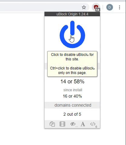
Disable uBlock Origin

Follow these easy steps to disable uBlock Origin

1)Click on the icon in the browser’s toolbar.
2)Click on the "Power" button.
3)Click on the "Refresh" button.
Go back

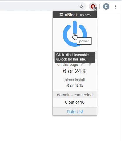
Disable uBlock

Follow these easy steps to disable uBlock

1)Click on the icon in the browser’s toolbar.
2)Click on the "Power" button.
3)Click on the "Refresh" button.
Go back
Back
Top