Hello, this is my first time asking a question so bare with me.
What I'm looking to do is have a dynamic chart based on the numbers in my excel sheet.
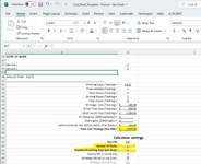
BACKGROUND:
So, in my job I have to estimate how much a project will cost based on the total estimated hours to complete the project. From that number I derive how many technicians I will need, and how many days those technicians will work.
In other words, if the total time for a project is 8 hours, I'll need one technician for one day. If the total time is 16 hours, I can either have one technician work for 2 days, or 2 technician for one day. Etc.
So what I'm looking to do is have a chart that basically says: Day 1, 2 techs (grouped close together), time it takes to complete the job for that day (let's say 10 hours). Day 2, 2 techs (grouped close together), time to completion. Etc.
Bonus points if the chart can change color once a tech reaches more than 8 hours total for the day (i.e. overtime)
I don't know if what I'm asking is even possible. Looking for insight.
What I'm looking to do is have a dynamic chart based on the numbers in my excel sheet.
BACKGROUND:
So, in my job I have to estimate how much a project will cost based on the total estimated hours to complete the project. From that number I derive how many technicians I will need, and how many days those technicians will work.
In other words, if the total time for a project is 8 hours, I'll need one technician for one day. If the total time is 16 hours, I can either have one technician work for 2 days, or 2 technician for one day. Etc.
So what I'm looking to do is have a chart that basically says: Day 1, 2 techs (grouped close together), time it takes to complete the job for that day (let's say 10 hours). Day 2, 2 techs (grouped close together), time to completion. Etc.
Bonus points if the chart can change color once a tech reaches more than 8 hours total for the day (i.e. overtime)
I don't know if what I'm asking is even possible. Looking for insight.