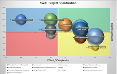
how can I update all the labels for all series in a bubble chart? I want the label to be the Series name with black fill at 60% transparency centered on the bubble. I've attached what I want it to look like without setting each one individually.
I have multiple questions, not sure if I should include them in one thread or not. But here goes... If I should separate them please let me know and I will do that next time.
I have 4 columns of data
Project Name, Effort (X Axis), Impact to Business (Y Axis), and Overall Score (Bubble Size).
If I create a series for each Project Name, then I can get the legend to show up with the project name, but I have to edit each individual data label on the bubble manually one by one.
If I create 1 series named project, I can get the data labels to show the Project Name using Value from Cells under label options and selecting the range with the Project names. However, if I do that, then I can't get the Legend to display the Project Name.
Also in order to get the legend to show up at the bottom, I have to shrink the chart size choose any place but bottom and then move the legend manually underneath the chart.
I would like to get the chart to be like in the picture without having to manually update everything every time someone adds a project. (would like to be able to have the chart update automatically when people add/remove projects or change values in the data set.
Thank you for your help it is greatly appreciated!
Gregg


