Adjusting Clustered Column to Enhance Smaller Numbers

akvpv6

New Member
Joined
May 1, 2023
Messages
21
Office Version
  1. 365
Platform
  1. Windows
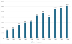
I need assistance in manipulating the visuals on the attached clustered column chart. As you can see on the side axis the minimum and maximum units are larger due to one set of data requiring a much larger number set (count) than the other (headcount).

Is there a way for the headcount bars to look larger so they aren't basically invisible on the graph, while keeping the count bars as close to how they appear currently? I have included the data sample as well below.
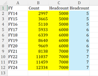
FYCountHeadcount
FY14
2997​
5​
FY15
3665​
5​
FY16
5110​
5​
FY17
5933​
6​
FY18
6339​
6​
FY19
8640​
6​
FY20
9669​
6​
FY21
8138​
7​
FY22
11037​
7​
FY23
11459​
7​
FY24
12334​
7​
 

Attachments

  • graph.PNG
    graph.PNG
    19.7 KB · Views: 6

Excel Facts

Excel Wisdom
Using a mouse in Excel is the work equivalent of wearing a lanyard when you first get to college
I am not sure if it is possible to post an external link here but look for "Add or remove a secondary axis in a chart in Excel" - this should solve your problem with visualisation.
 
Upvote 0
I am not sure if it is possible to post an external link here but look for "Add or remove a secondary axis in a chart in Excel" - this should solve your problem with visualisation.
I did try with a secondary axis however I am not trying to have the headcount as a line and when you select anything else other than a line it messes up the main chart
 
Upvote 0
I see. Well, then you could e.g. multiple the Headcount by 1,000, create another column with original Headcount values and then select "Values from Cells" in Label Options...
 
Upvote 0
I see. Well, then you could e.g. multiple the Headcount by 1,000, create another column with original Headcount values and then select "Values from Cells" in Label Options...
do you mind elaborating on this? I feel like this might work but I am unsure on how I would select the correct data if there is two headcount columns
 
Upvote 0
What I mean is that you select clustered column chart with 2 categories (yellow) and then in Label Options select "Value from Cells" for the "Headcount" and select the corresponding data (blue).
 

Attachments

  • G.png
    G.png
    23.9 KB · Views: 6
  • L.png
    L.png
    13.4 KB · Views: 7
Upvote 1
Solution
What I mean is that you select clustered column chart with 2 categories (yellow) and then in Label Options select "Value from Cells" for the "Headcount" and select the corresponding data (blue).
Bingo! that worked, thank you!
 
Upvote 0

Forum statistics

Threads
1,220,965
Messages
6,157,119
Members
451,399
Latest member
alchavar

We've detected that you are using an adblocker.

We have a great community of people providing Excel help here, but the hosting costs are enormous. You can help keep this site running by allowing ads on MrExcel.com.
Allow Ads at MrExcel

Which adblocker are you using?

Disable AdBlock

Follow these easy steps to disable AdBlock

1)Click on the icon in the browser’s toolbar.
2)Click on the icon in the browser’s toolbar.
2)Click on the "Pause on this site" option.
Go back

Disable AdBlock Plus

Follow these easy steps to disable AdBlock Plus

1)Click on the icon in the browser’s toolbar.
2)Click on the toggle to disable it for "mrexcel.com".
Go back

Disable uBlock Origin

Follow these easy steps to disable uBlock Origin

1)Click on the icon in the browser’s toolbar.
2)Click on the "Power" button.
3)Click on the "Refresh" button.
Go back

Disable uBlock

Follow these easy steps to disable uBlock

1)Click on the icon in the browser’s toolbar.
2)Click on the "Power" button.
3)Click on the "Refresh" button.
Go back
Back
Top