Hello,
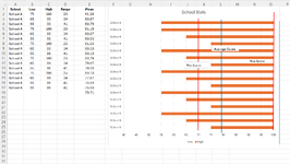
I have a horizontal bar chart that shows the following for multiple schools: Passing Score (70), Max Score (100), Mean Score, Std Dev -1 and +1. To show these 5 criteria as vertical lines on the bar chart, I've had to manually insert a line, using the Shapes icon. I've tried multiple times to use the "Select Data Source" option to formulate where the lines should be, but I haven't had any luck. My x-axis represents the score range, my y-axis represents the schools.
I've added a demo chart of the lines that I would like to represent on the chart for reference (Std Dev not shown). Please let me know of a way to automatically format the vertical lines, vs. manually. Thanks!


