Add a Trendline to a Chart
September 22, 2004
Many know how to use Excel to chart existing data. It is also possible to have Excel automatically add a trend line to show the slope of data points. In this chart, I've been using Ron Martin's Weight Loss Tracker for 3 weeks. The green line is actual data and the straight black line is where I would have needed to be in order to hit my goal for the month.
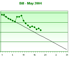
It struck me that the green line is trending downward, but not as quickly as I would like. I wanted to do a quick forecast to see where I would be at the end of the month if I continued at the historical rate. Luckily, Excel provides the ability to do this in 3 mouse clicks.
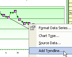
Right-click the green data series in the chart. From the pop-up menu, select "Add Trendline...".
In the Add Trendline dialog, there are 6 types of trendlines available. In this case, I am assuming a linear trend, so I click OK.
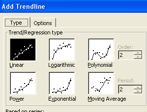
Instantly, Excel projects a trendline and adds it to the chart.
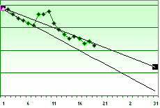
This trendline indicates that based on my prior results, I will miss my goal for the month.
The default trendline is drawn in basic black. If you want to change the appearance of the trendline, right-click the trendline and choose Format Trendline.
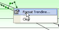
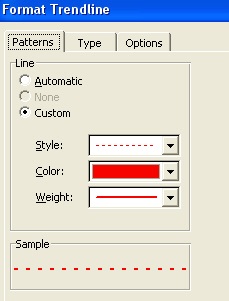
The Format Trendline dialog is like the Add Trendline dialog. A new "Format" tab allows you to change the color and linestyle.
The Add Trendline worked because my particular series range is set up for 31 days. The remaining days in the series are blank. If my data series did not contain any blank cells for future days, then I would have needed to use the Options tab of either Trendline dialog.
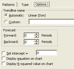
On the Options tab, you can specify that the trendline should forecast forward any number of periods.
In this image, I've changed the trendline to a dotted red line.
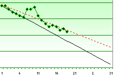
It takes just a few clicks to have Excel forecast future results with the Trendline feature of charts. Past results may not be the perfect indicator of future results, but it can give you another indicator if you are on the right track.
