
Build A Visually Striking Dashboard with PowerPivot, MS ADM and Excel 2010
Update
The Winners of this MrExcel Challenge have been selected!
Click HERE to view the Winning Entries for the MrExcel Challenge of The Month for *May 2011!
* Please Note that this contest is ended and winners have been selected and awarded.
The Contest Rules – Reviving the Challenge of the Month
From May 5, 2011 to June 4, 2011, the challenge will be for you to think of and then create the most visually striking dashboard you can imagine using Microsoft PowerPivot and Microsoft Azure Data Marketplace together in Microsoft Excel 2010! Just Build it!
How It Works: The Dashboard must be built in Excel 2010, using PowerPivot to mash up two (2) or more Data Sets. At least one (1) Data Set should be coming via Azure Data Marketplace [ADM] …Hint: How about Crime Stats or Weather Data? Key to this competition is the phrase ‘Visually Striking Dashboard’; consider the use of Charts, Conditional Formatting, Sparklines, SmartArt, WordArt and More. The limitations are merely the extent of your imagination for this one!
Entries will be required to include no fewer than three (3) screenshots of your masterpiece and perhaps a little text to fill us in on execution and what inspired your creation! Your Screenshots will be featured on this page following the contest and awarding of prizes!
Challenge Deadline: June 4, 2011 by 11:59 PM (23:59 Hrs) EDT.
- Prize #1 – Reader’s Choice Award [everyone gets to choose their favorite].
- Prize #2 – A Panel of Judges from MrExcel and Microsoft will choose their favorite.
Other Considerations for You:
- Want to share your ‘Challenge Tips’ with others? Load your video up to YouTube and send us the link – Consult-at-MrExcel-dot-Com !
- Contribute your ‘Challenge Tips’ to the MrExcel Message Board – Use This Thread.
- Already have an Xbox360? Help a friend, lend a hand – get involved and have some fun!
Future Amendments to This Page will be denoted at the top of the page with a bookmark link to the pertinent information.
Voting Booth for Reader’s Choice will be set up and announced [ here and on the MrExcel Message Board ] nearing the end of the May 2011 Challenge.
The Prizes: There will be TWO (2) prizes for this contest [one (1) per each of the two (2) categories] – the top two selected entries will receive anXBOX 360 with Kinect!
Send your entries to Consult-at-MrExcel-dot-Com.
Terms & Conditions:
Additional to General form of Terms and Conditions:
- Each of the 2 prizes offered consists of 1 XBOX360 and 1 Kinect device each: service to operate said devices is strictly the responsibility of the contestant.
- The Prize Packages are US versions of the Xbox360 and Kinect. If you are outside of the USA, you are responsible for incoming customs and duties [see below], as well as any local adapter required to convert the US power cord/service for use [see above].
Results
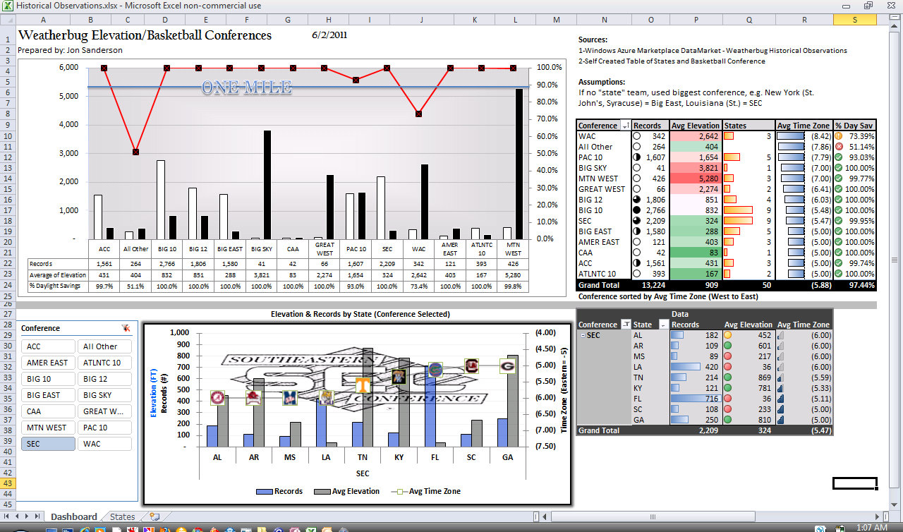
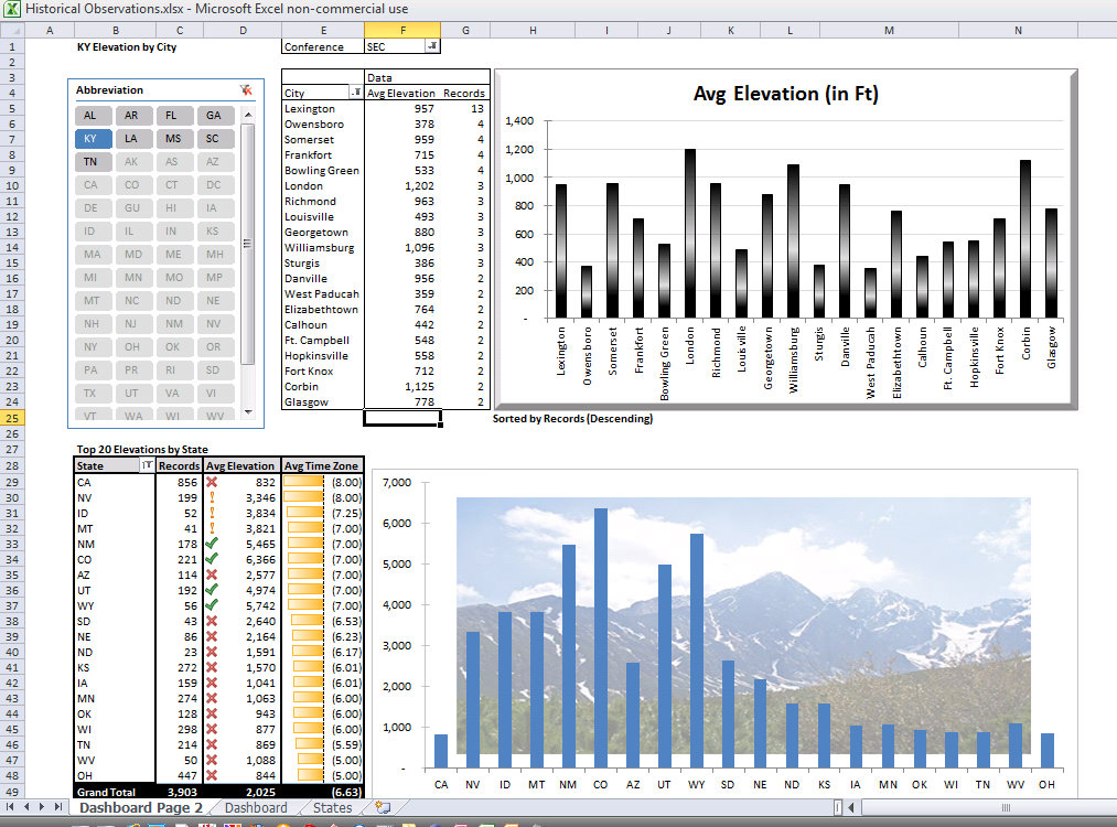
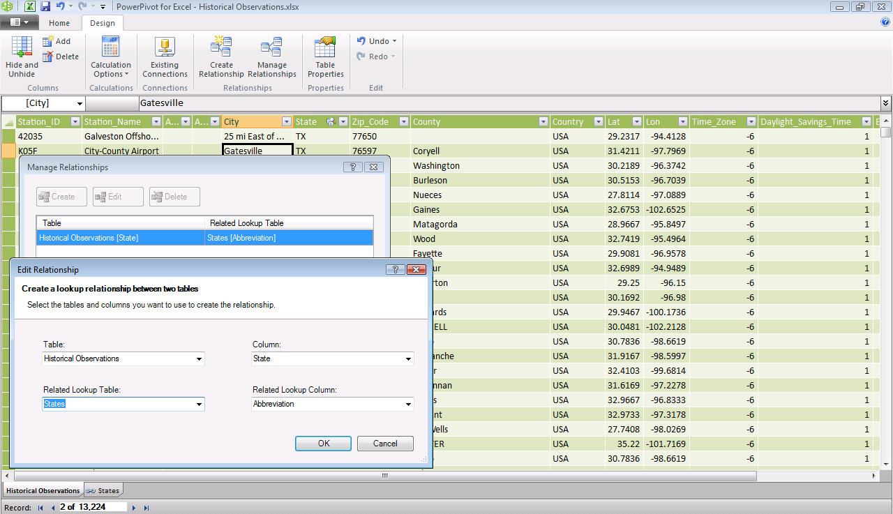
Jon Sanderson: using 'Weatherbug Historical Observations' via Windows Azure Marketplace DataMarket
Jon writes:
"I pulled the Windows Azure Marketplace DataMarket - Weatherbug Historical Observations to get the elevation of 13,324 records of Weatherbug locations that track current weather conditions. I then put together a table of the 50 states and which basketball conference that "state" team belongs. All of the SEC schools for example, have state schools in their conference. I made high level assumptions on states like Louisiana (LSU), Pennsylvania (Penn St over Penn), Ohio St, etc. I wanted to see the average elevation by conference, and also pulled into the time zone to sort west to east to see if the logic made sense. I feel it turned out very well, while these type of calculations aren't necessarily real world, I felt like that was the outside of the box thinking you were looking for."
Screenshots of Jon's creation
Tushar Mehta: Sent in several entries using PowerPivot and Windows Azure Marketplace DataMarket.
Tushar writes:
Entry #1
This dashboard adapted a visualization technique I created some time ago to color shapes in an Excel object so that the net result is a visual dashboard that conveys information in a natural context – in this case a map of the U.S.
I integrated several Excel components with my software to create this solution. Data from the Azure Data Market, together with USPS web data were added to a PowerPivot database, which was the source for a PivotTable (PT) in Excel. Slicers filtered the PivotTable and downstream analysis updated a map of the U.S.
Entry #2
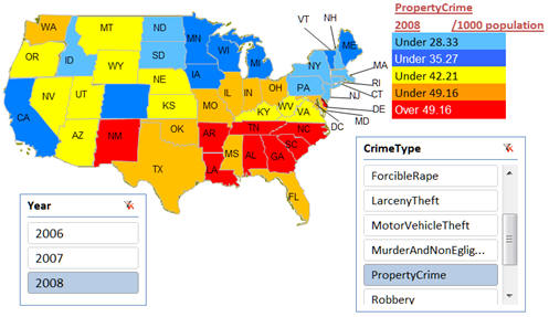
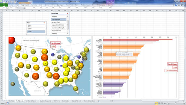
This dashboard shows U.S. crime statistics on a state level in their ‘natural’ context, i.e., a U.S. map. At the same time, a more traditional bar chart shows the data in a different by equally relevant layout.
In the snapshot below I have intentionally left visible elements of the Excel environment. While the row and column headers and gridlines serve no useful purpose in the dashboard they do remind the viewer that this is an Excel workbook.
Entry #3
This dashboard shows U.S. crime statistics on a state level in their ‘natural’ context, i.e., a U.S. map. At the same time, a more traditional bar chart shows the data in a different by equally relevant layout.
The use of the map of the U.S. with appropriately located bubbles lets one see data in their natural context, something that may reveal patterns that might otherwise not be obvious – at least not without more work – a lot more work in some cases. The map I used did not include Alaska and Hawaii. So, I located their bubbles in their general direction.
The charts are synchronized and controlled by the 2 slicers, one for the year and the other for the type of crime.
The first chart ( REF _Ref294975583 \h Figure 1) uses the same color scheme for all data values. Consequently, it relies strictly on the size of the bubble to convey information about the relative number of crimes of interest.
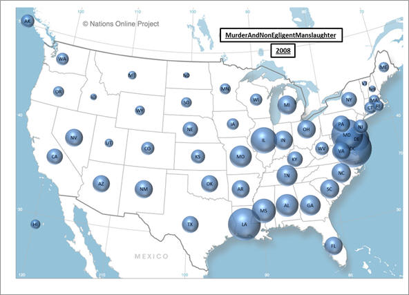
SEQ Figure \* ARABIC 1 – Murder statistics for 2008 across U.S. states.
The data are adjusted to represent the crime rate per 1,000 of the state’s population
Entry #3 cont.
The second chart uses ‘conditional’ colors to show three ranges of values. The conditional colors are created by plotting each data point in one, and only one, of three series. The three series are then colored differently.
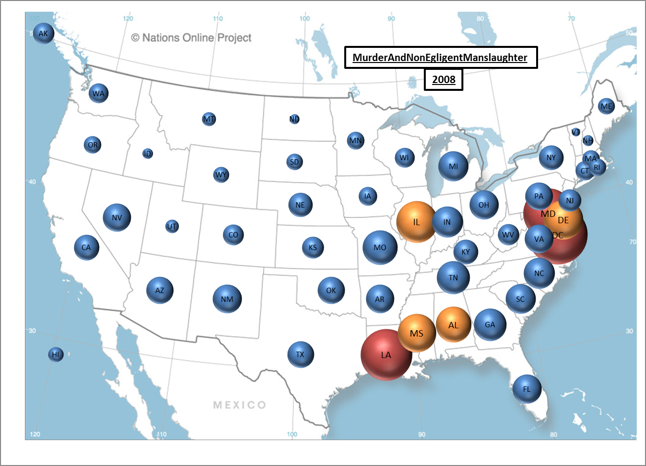
SEQ Figure \* ARABIC 2 – Murder statistics for U.S. states for 2008.
The data are adjusted to represent the crime rate per 1,000 of the state’s population
Congratulations to our winners!! -The MrExcel Team